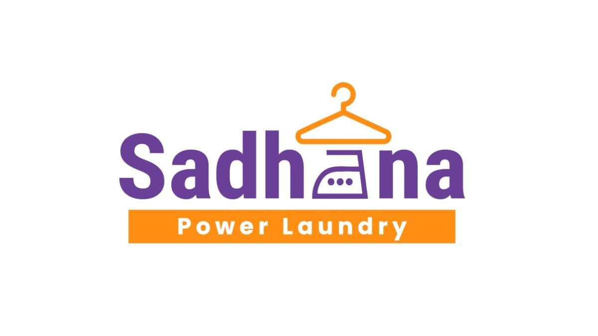
New Delhi [India], August 19: For decades, Sadhana Power Laundry has been a cornerstone of reliability, trust and excellence in laundry services in Ghatkopar, Mumbai. Established in 1965 by their visionary founder, Shri Kalyandas Vithaldas Chauhan, their journey has been defined by an unwavering commitment to quality, innovation, and customer satisfaction. “It is with immense pride and excitement that we announce a significant milestone in our storied history: the grand unveiling of our brand-new store and logo, which also marks our 60th anniversary in 2025, said Shri Pradeep Kalyandas Chauhan, the 2nd-generation owner of Sadhana Power Laundry.
“This isn’t just a change of look and feel of the store and logo image; it’s a powerful statement about our enduring legacy and our vibrant future. Our original logo, while serving us faithfully for the last 10 years, needed a change for the dynamic, forward-thinking entity that Sadhana Power Laundry wants to become. To achieve this, we partnered with my son’s Brand Path Marketing Consultancy. His expertise in strategic branding and innovative design has proved invaluable in translating our vision into a compelling visual reality,” added Shri Pradeep Kalyandas Chauhan.
The design process was a collaborative and thoughtful endeavour. Brand Path Marketing Consultancy delved deep into the company’s values, history, and aspirations. They understood that the new logo needed to symbolize not just cleanliness, but also efficiency, trust, and the varied services they offer to their customers. The result is a modern, sleek, and impactful design that perfectly encapsulates Sadhana Power Laundry’s commitment to delivering fresh, powerful laundry solutions not just for clothes, but also for soft toys, shoes, bags, carpets, home linen, bath linen and more.
The new emblem, with its thoughtful integration of contemporary elements like the ‘hanger’ and ‘iron’ is a nod to their core services. The vibrant colors of orange and purple reflect a bright future while the white symbolises cleanliness and hygiene.
“The 3 dots in the ‘iron’ which also translates to an ‘a’ resembles the 3 generations – my grandfather Shri Kalyandas Vithaldas Chauhan, my father Shri Pradeep Kalyandas Chauhan, and me, Shri Jinesh Pradeep Chauhan. Both my grandfather and father have worked hard enough, and this logo is a tribute to them from my side. Designing this came very naturally to me. Along with the new store design and logo design, we also redesigned the packaging and branding elements in the new store,” said Shri Jinesh Pradep Chauhan, who is also the founder of Brand Path Marketing Consultancy Services.
The new logo is more than just a graphic; it’s a beacon of their ongoing journey, a symbol of renewed energy, and a clear indicator of a future-forward approach. Here’s to many more years of clean, fresh, and powerful laundry experiences!
For more details, visit https://sadhanalaundry.in/
If you object to the content of this press release, please notify us at pr.error.rectification@gmail.com. We will respond and rectify the situation within 24 hours.

